Covers for MMYOPE
designing these covers often comes right after we figure out a project's title and right before we begin production. being as clear with each book's intentions is a priority, mostly for the production phase than for the reader.
the more landmarks we can plant early in the process the least likely we are to get off track — the safer it is to explore.
i am inspired by les éditions de minuit, in many ways, for many reasons. their cover design is a source of stability, an endorsment of the content by the publisher. with these i want to make soft reflections of the story, all the while maintaining a thread between each of these distinct publications.
NYC TAP
i used one faye blue's incredible etchings - the flattest she handed in.
it serves as a ground for the oversized type on both covers (this book is printed in tête-bêche format), and a hint to the theme of growth in the book itself.
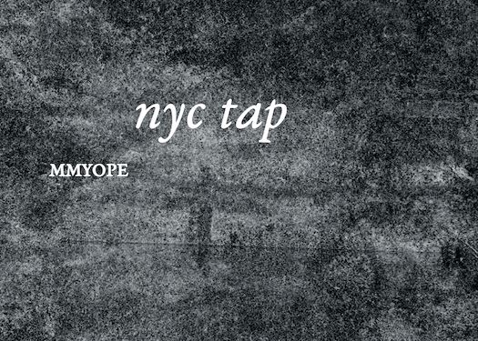
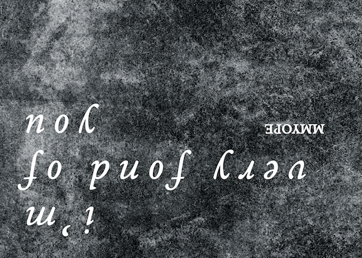
nyctap on one side, i'm very fond of you on the other.
GLAD
key to this book are the qr codes that ariana freitag used to upload the neural network models they developed. without opening the book it is possible to enter the story.
furthermore, the square is glad's dominant shape - having it repeated both in the book's dimensions and the shape of the qr felt relevant.
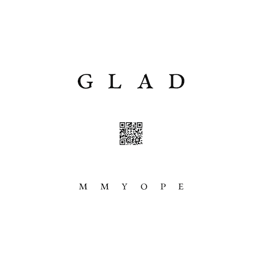
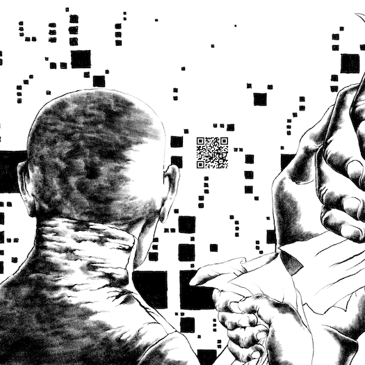
there are 15 other codes in the book, each clarifying the previous one.
RECANTING EM
we thought about asynchronous looping, how violence reasons itself, the manner by which the injurious party avoids forgiveness and yet seeks proximity with the injured.
the mental and physical contortion that all these ideas require is reflected in the cover as the type wraps to the back cover. the type wraps around the pages' face, not the spine — in effect holding the book shut.
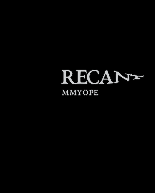
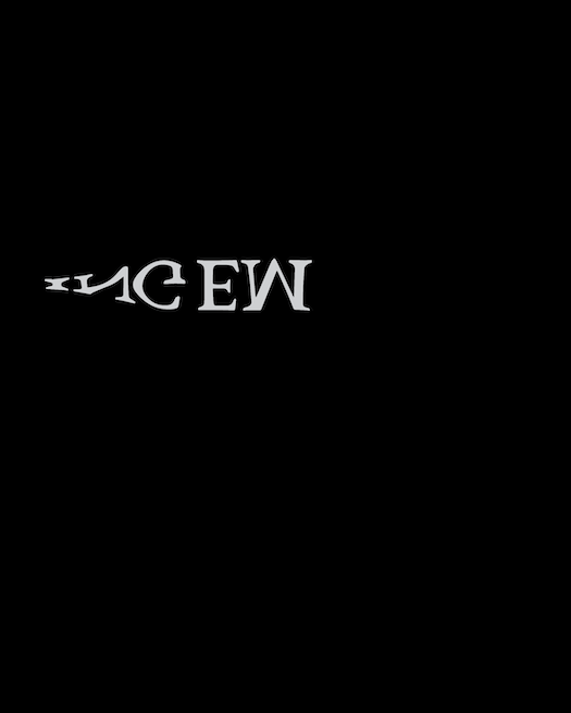
illegibility and obstruction play a large role in this book.
WILLOWS IN THE LAND OF FEET
willows is really the story of apprehension and assumptions. it follows a group of teenagers as they make their way through to adulthood. the lines that are drawn. such and such.
i was inspired by calligramme poetry for the cover — using the type as an image without devaluing the title itself.
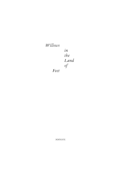
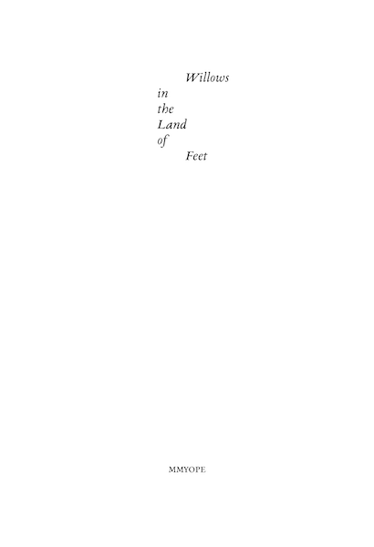
being able to break it in half for the title page, without totally breaking it.